10. Graphs – Non-Linear
Non-Linear Relationships
In the previous checkpoint, we looked at linear relationships – this is when the relationship between two variables can be represented by a straight line on a graph. The change in one variable is always proportional to the change in the other variable.
A non-linear relationship is when the relationship between two variables cannot be represented by a straight line. The change in one variable does not have a constant proportion to the change in the other variable. The graph is a curve or some other non-straight shape.
There are many types of non-linear relationships.
For example, the area of a square vs. its side length: As the side length increases, the area increases at a faster rate (quadratic relationship). Another example is the height of a bouncing ball vs. time: The ball's height decreases and increases in a curved pattern (could be modelled by a parabola or a more complex curve if you consider energy loss). Finally, this example is a finance example - the amount of money in a savings account with compound interest vs. time: The amount grows exponentially over time.
Which of the following scenarios do you think, is most likely to be represented by a non-linear graph and why (discussed in video)?
a) The total cost of buying apples at a fixed price per apple vs. the number of apples.
b) The distance travelled by a car moving at a constant speed vs. time.
c) The height of a tree growing each year vs. time.
d) The temperature of water in a kettle as it is heated to boiling point vs time.
Are you able to sketch a simple graph that could represent the relationship between the number of hours you study for a test and your test score. Explain why you chose the shape you did.
Solutions:
c) and d) The height of a tree growing each year vs time and the temperature of water in a kettle as it is heated to boiling point vs time. Both are more likely to be represented by a non-linear graph. Tree growth often slows down as the tree matures, and the temperature of water will increase at a slower rate as it gets closer to the boiling point.
(Graph would likely show a curve that starts relatively flat, then increases more steeply, and might eventually level off or even decrease if you over-study). Explanation: Studying more generally leads to higher scores, but there's likely a point of diminishing returns where extra studying yields less and less improvement, and over-studying might even lead to worse performance due to fatigue or stress.
Graphs of Non-Linear Data
Because of time constraints in the exam, it would not be common for you to plot your own graphs. You may, however, need to be able to analyse provided graphs and identify their key features to determine which best illustrates a given relationship or mathematical problem.
When looking at graphs, you don’t want to make ‘easy’ mistakes, so consider the following:
- Look at the range of values for both variables (the independent variable, usually on the x-axis, and the dependent variable, usually on the y-axis).
- The scale of the axis and intervals
- If asked to find a data point, remember that each data point is an ordered pair (x, y). Find the x-value on the x-axis and the y-value on the y-axis. Mark the point where the corresponding grid lines intersect.
An example question in an exam could be this:
You are given the following data – which one of the four graphs would best represent the data provided to you?

Option A & C: 
Option B & C: 
A is the correct answer.
How do you think the assessor in the exam could make this question harder? It could be in the stimulus material. For example, how about if the data was accompanied by wording to say that there was an error and the height was actually double what was listed on the table. You’d have to then evaluate based on the updated calculated figures.
Can you visualise what the graph would look like? Would it be narrower or wider? And why?
Interpreting and Analysing Non-Linear Graphs
Understanding graphs isn’t just something you naturally know, it’s about learning how to interpret parts of the graph and what they stand for. Here are general tips:
- Look at the trend: Is the graph generally going up (increasing) or going down (decreasing)?
- Rate of Change: Is the graph getting steeper (faster rate of change) or flatter (slower rate of change)?
- Maximum/Minimum: Does the graph have a highest point (maximum) or a lowest point (minimum)? What do these points represent in the context of the problem?
- Curvature: Is the graph curving upwards or downwards? What does the curvature tell you about the relationship?
So, what can you do with the information in the graph?
- Make predictions: Interpolation: Estimating values between plotted data points. Extrapolation: Estimating values beyond the plotted data points. Be cautious with extrapolation, as the trend might not continue. Always consider the real-world situation when making predictions. Do your predictions make sense?
- Drawing conclusions: Relate the graph to the real world - what does the shape of the graph tell you about the relationship between the variables in the real-life scenario? Use your interpretation of the graph to answer the specific question being asked.
Let’s consider the following graph of a bouncing ball.

What can you ‘read’ from it?
- Trend: The graph shows a series of decreasing peaks (maximums) over time.
- Interpretation: Each peak represents a bounce. The decreasing height of the peaks indicates that the ball is losing energy with each bounce.
- Prediction: You could interpolate to estimate the height of the ball at a time between two plotted points. You could extrapolate (cautiously) to estimate when the ball will stop bouncing completely, but this would be less reliable.
- Conclusion: The graph illustrates that the ball bounces to a lower height each time due to energy loss, eventually coming to rest.
What kind of questions do you think the assessor could make from that graph? It’s always good to think about these things as this helps you to understand how to work with the concept in more detail.
Here’s an example:
If the ball were dropped from a higher initial height, how would the shape of the graph change? Would it be wider, narrower, taller, shorter, or stay the same basic shape?
The overall shape of the graph would remain similar (a series of decreasing peaks), but it would be taller overall. The peaks would be higher, and the curve would take longer to approach zero.
Let’s now discuss some of the common graphical representations of non-linear relationships.
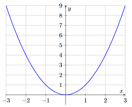
- This is called a parabola and while you most likely won’t need to work with its formula as that’s beyond the Year 8 curriculum, it’s important to still understand it (and the other relationships below) intuitively. The relationship here is when you throw a ball upwards, it initially goes up, slows down, reaches a maximum height, and then falls back down. The effect of gravity on the ball causes its upward speed to decrease at a constant rate until it reaches the peak and starts falling. This constant deceleration (and then acceleration downwards) results in the parabolic shape.
- This is called exponential and for fast growth. Imagine a population of bacteria that doubles every hour. If you start with one bacterium, after one hour you have two, after two hours you have four, then eight, and so on. This rapid, accelerating growth is exponential. And this is what it looks like in a graph.

- This is called square root. If you have a square, and you want to know the length of one side, you can find it by taking the square root of the area. As the area increases, the side length also increases, but at a decreasing rate.

- This is called reciprocal. If you need to travel a certain distance (say, 100 kilometres), the faster you go, the less time it will take. If you double your speed, you halve the time. Time is inversely proportional to speed when distance is constant. This inverse relationship is represented by the reciprocal function.

- This is called cubic. If you have a cube, and you want to know its volume, you multiply the side length by itself three times (side * side * side). As the side length increases, the volume increases at a much faster rate. The volume of a cube is calculated by cubing the side length (side * side * side = side3), which is where the cubic relationship comes from.

Practice time!
Now, it's your turn to practice.
The questions in this checkpoint are provided to give you an introduction to possible questions you may see in your exam. Don't worry too much as you'll continue to build your skills throughout the course.
Click on the button below and start your practice questions. We recommend doing untimed mode first, and then, when you're ready, do timed mode.
Every question has a suggested solutions videos after you complete the question. This video explains to you the steps to take to answer the question and provides tips and tricks.
Once you're done with the practice questions, move on to the next checkpoint.
Now, let’s get started on your practice questions.
10 questions
Take a Timed Test Take an Untimed Test